PowerUniverse
Electronics accessories


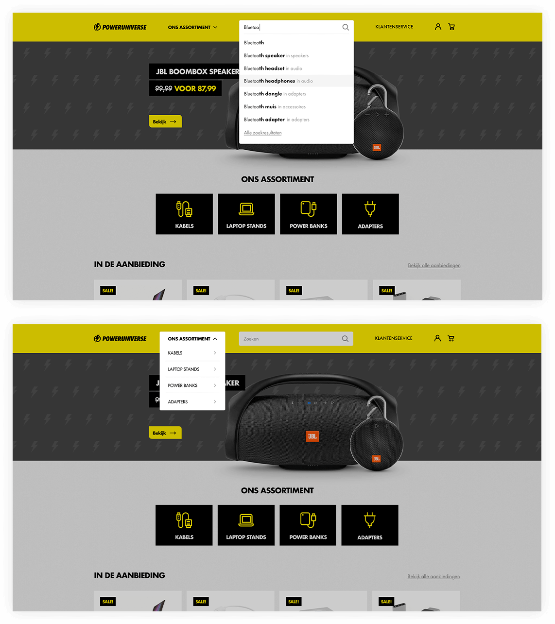
E-commerce solution for electronics accessories


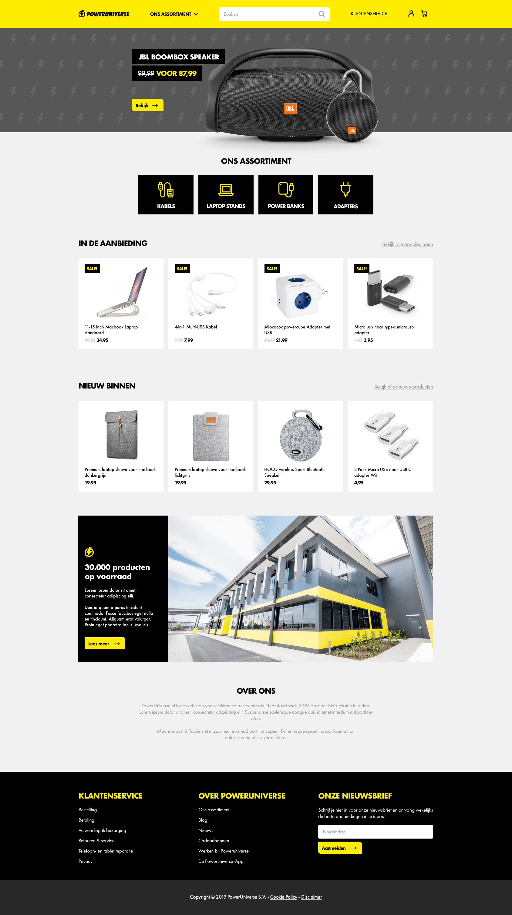
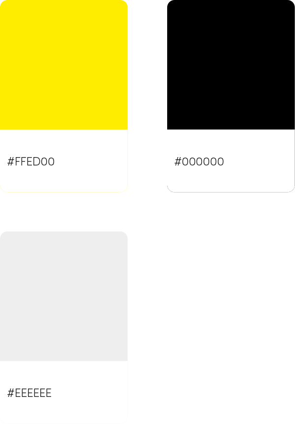
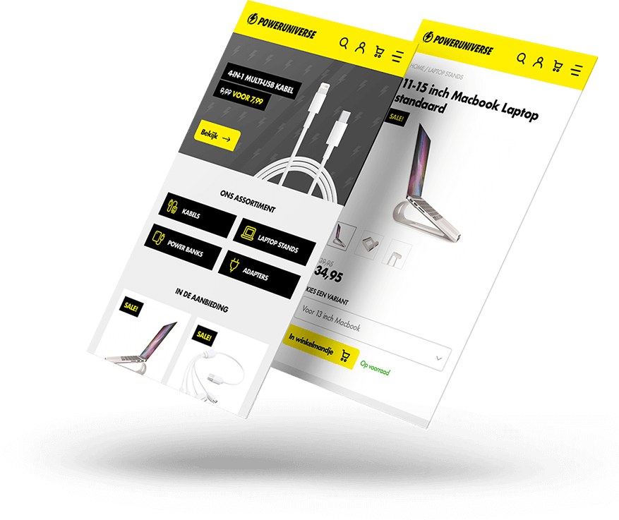
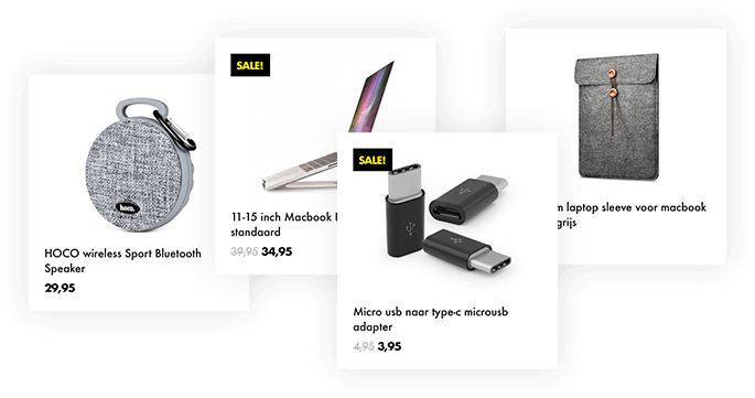
For PowerUniverse I created the Identity with a bold yellow color scheme, to stand out amongst the competition. Together with a clean and simple user interface, it turned out to be a really fresh look and feel.

Period:
2019
Role:
Concept Design, UX/UI Design
Business type:
E-commerce

Styleguide


A small styleguide for PowerUniverse.

Order your electronics accessories on the go


Since more and more people place orders while on the go on a mobile device, the site is completely responsive. Especially on the product page, it is important that the user has a clear view of the product and product options.

I also made sure that the order button is in the viewport on the most used screen resolutions.

Stacks on stacks on stacks


The products (obviously) are the heart and soul of the webshop. I made product blocks which always have the same look and feel througout the shop and they are adaptable to the size of their container, so they can be used everywhere.

Decluttering the interface


A lot of e-commerce platforms are like a christmas tree. There's so much going on, that the user is lost in a sea of information. To declutter the interface, the menu has 1 dropdown link to the entire catalog. If you open the dropdown, the rest of the page us darkened, to focus on the content of the dropdown.

The same goes for the search. It is a livesearch, with instant results.

See more


Check out some other recent projects.